library(tidyverse)
library(reshape2)
library(tseries)
library(forecast)
Introduction
The purpose of this project is to demonstrate how various data science techniques can be employed to collect and manipulate current COVID-19 death data for effective visualizations and predictive modeling. I aim to demonstrate how to recreate some of the coronavirus graphics that are currently available to the public on statistical websites. I will also show an appropriate short-term model that could likely be applied to any country that shows some downward concavity in the log of their cumulative distribution function.
Data
Data for this project were pulled using the following code:
urlDeath <- paste("https://raw.githubusercontent.com/CSSEGISandData/COVID-19/master/",
            "csse_covid_19_data/csse_covid_19_time_series/time_series_covid19_deaths_global.csv",
                  sep="")
data <- read.csv(urlDeath)
After viewing this dataset, I found that many of the countries have very low death counts. This is likely in large part because of the populations of these countries. For my purposes, I chose to exclude countries with limited death counts to reduce noise in some of my plots. I also discovered a few data errors that required a manual fix. Germany had an instance where their CDF dropped from April 10th to the 11th. Since this isn’t possible, I overwrote the error with an estimate from other reports. Recent corrections to misreported data from China also caused some noticable data errors. Since I cannot allocate the new deaths appropriately backwards, I chose to replace them in order to preserve the observed trend.
data2 <- subset(data, X4.16.20 > 1000)

data2 <- data2[1:95]

data2[5,"X4.11.20"] <- 2912

data2[3,c("X4.17.20","X4.18.20","X4.19.20", "X4.20.20","X4.21.20")] <- 3223
Deriving Distributions and Their Transpositions
Using the CDFs for corona deaths, I built the associated PDFs and also the logCDF which has been used quite a bit for visualization purposes.
#Create logCDF
logdf <- cbind(data2[1:4],log(data2[,5:ncol(data2)]+1))

#Create PDF
pdf <- data2[-5]
for(i in 6:ncol(data2)){
  pdf[,i-1] <- data2[,i]-data2[,i-1]
}
In order to plot these data, I first had to transpose them to be effectively read into the ggplot function. The melt function in the reshape2 package transforms each dataset into an n times m by 3 matrix where the columns are days (id), country (variable), and the logCDF or PDF value (value). This effectively allows me to plot multiple countries onto the same canvas.
#Transpose LogCDF
lnames <- logdf$Country.Region
tlogdf <- logdf[-(1:4)]
tlogdf <- as.data.frame(t(tlogdf))
colnames(tlogdf) <- lnames
tlogdf$id <- 1:nrow(tlogdf)
glogdf <- melt(tlogdf, id.var="id")

#Transpose PDF
pnames <- pdf$Country.Region
tpdf <- pdf[-(1:4)]
tpdf <- as.data.frame(t(tpdf))
colnames(tpdf) <- pnames
tpdf$id <- 1:nrow(tpdf)
gpdf <- melt(tpdf, id.var="id")
PDF Plots
I’ve generated the first of several pdf plots below.
ggplot(gpdf, aes(x=id, y=value, group=variable, colour=variable))+
  geom_point()+geom_line()+xlab("Days After Outbreak")+ylab("Daily Death Counts")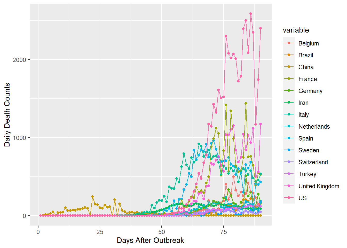
This comprehesive plot is quite messy, but lays the foundation for some of the plots to follow. We can observe that all of the countries, except the US, have pdf values below 1500. We can also see that only China has deaths within the first month or so of data. China seems to have seen it’s highest daily deaths a little over a month after they began occurring. The US appears to still be climbing, but is about a month beyond it’s first deaths. It will be interesting to see how it’s pattern and China’s compare to the rest of the world.
Moving forward I will eliminate these two countries, so that I can unclutter the mess into a clean visualization that is more informative.
gpdf1 <- subset(gpdf, variable != "US" & variable != "China")
ggplot(gpdf1[which(gpdf1$id > 49),], aes(x=id, y=value, group=variable, colour=variable))+
  geom_point()+geom_line()+xlab("Days After Outbreak")+ylab("Daily Death Counts")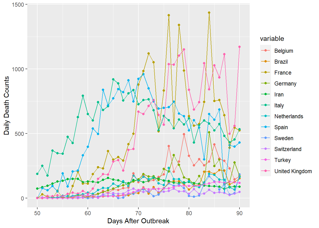
Now the graph above is better, but I think that 12 countries is still pretty messy. Consequently, I’ve split the data into two groups of high and low death counts.
gpdf2 <- subset(gpdf, variable == "France"|variable == "United Kingdom"|variable == "Spain"|
                  variable == "Italy"|variable == "Belgium"|variable == "Germany")
gpdf2 <- subset(gpdf2, id > 49)
ggplot(gpdf2, aes(x=id, y=value, group=variable, colour=variable))+geom_point()+
  geom_line()+xlab("Days After Outbreak")+ylab("Daily Death Counts")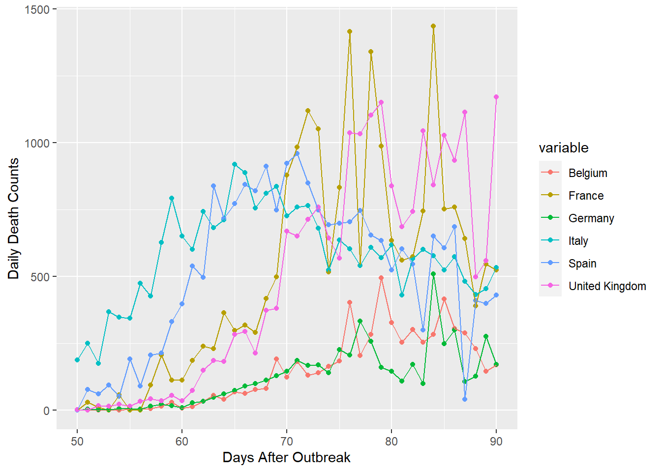
The plot of high counts, shown above, has more information about death peaks. Spain and Italy appear to have reached their climax at about day 70, approximately 20 to 30 days after deaths began to occur. France is extremely volatile and is consequently difficult to forecast. France, Belguim, Germany, and the United Kingdom, may have peaked very recently or have yet to see their maximum daily deaths.
gpdf3 <- anti_join(gpdf1, gpdf2, by = "variable")
gpdf3 <- subset(gpdf3, id > 49)
ggplot(gpdf3, aes(x=id, y=value, group=variable, colour=variable))+geom_point()+
  geom_line()+xlab("Days After Outbreak")+ylab("Daily Death Counts")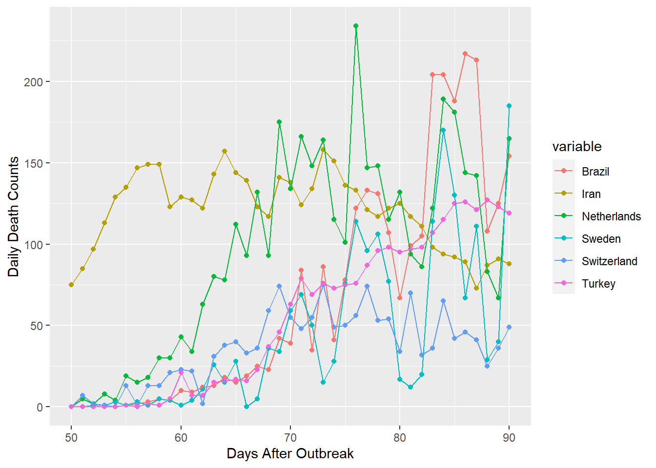
My lower group of countries were plotted on the same range as the prior group. I can see evidence that Iran and the Netherlands have already reached their peaks at about day 75, around 30 to 45 days after deaths began. Meanwhile, Brazil, Sweden, Switzerland, and Turkey still appear to be climbing. However, their rates of increase seem to be almost linear or logarithmic. This is much better than exponential growth and the observed trends could imply that they will reach their climax soon.
logCDF Plots
Moving beyond PDFs to distributions that are more relevant for predictive modeling, I next plotted the logCDFs for each country. The original plot is shown below.
ggplot(glogdf[which(glogdf$value > 2.3),], aes(x=id, y=value, group=variable, colour=variable))+
  geom_point()+geom_line()+xlab("Days After Outbreak")+ylab("Log of Cumulative Deaths")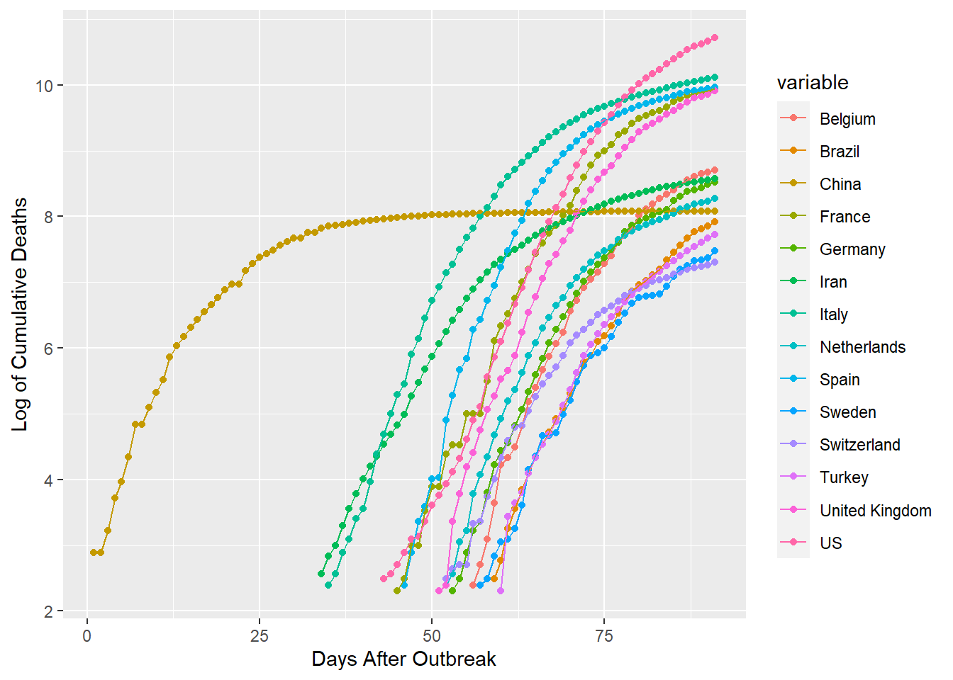
Plots for these distributions seem to be better equipped to handle more countries. This graph is somewhat helpful, but it can be improved. I’ve graphed the logCDFs following the point where each country has seen 10 total deaths. Now I’d like to align each of these starting points at id 1, so that id is counting days after 10 total deaths rather than days since the outbreak began in China.
stcdf <- tlogdf
for(i in 1:nrow(stcdf)){
for(j in 1:ncol(stcdf)){
  stcdf[i,j] <- ifelse(tlogdf[i,j] < 2.3, Inf, tlogdf[i,j])
}
}

sortdf <- apply(stcdf,2,sort,decreasing=F)
sdf <- as.data.frame(ifelse(sortdf==Inf,0,sortdf))
sdf$id <- 1:nrow(sdf)
gcdf <- melt(sdf, id.var="id")

ggplot(gcdf[which(gcdf$value > 2.3 & gcdf$id < 61),], aes(x=id, y=value, group=variable,
              colour=variable))+geom_point()+geom_line()+xlab("Days After Country's 10th Death")+
              ylab("Log of Cumulative Deaths")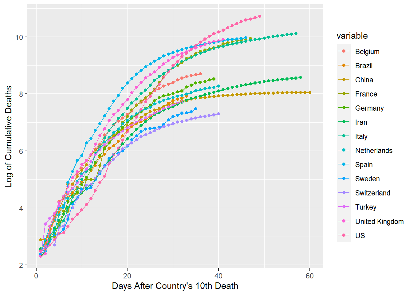
From the resulting plot, we can see approximate durations of exposure to the corona virus for each country. The amount of overlap is quite incredible. It seems that the first 20 days consistantly have a slope from about .3 to .4. The next 20 days show that the slopes change to around .07 to .17. The final 20 days of this graph appear to be on track for slopes of approximately 0 to .05. I would guess that the trends of Italy and Iran are very informative for predicting what rate changes will happen with the countries behind them in duration.
Time Series Forecasting
Logs are interesting and helpful visual displays for rate of change, but they are tricky when considering quantities. This is important to remember when developing a predictive model. We might feel inclined to use multiple countries to predict another country’s cumulative deaths tomorrow. However, our logarithmic data is highly collinear so estimated coefficients are likely to be contradictory and exaggerated. I originally attempted such a regression and observed this problem. While ridging techniques or partial least squares models might be decent candidates, I think that there is a better approach immediately available.
The most sensible model for a given country would use that country’s quantative data and rate data from yesterday to predict today’s deaths. This can be accomplished through a time series such as an ARIMA or ETS model. It deals with unknown covariates very well, since there is often very little difference between yesterday’s demographics, healthcare systems, politics, etc. and those of today when looking at the same country. I originally attempted such a model on the logCDFs, but found that it struggled to develop enough depth to generate forecasts for the strong rate of change that we might expect. In this case, and most time series cases, it was more reasonable to build a model on the untransformed data and then transform the results(see below for US).
us1 <- tlogdf$US
us1 <- us1[us1>2.3]

us <- exp(us1)-1
ts <- ts(us, class = "ts")
fts <- as.data.frame(forecast(auto.arima(ts), h=20))
lfts<- log(fts)
lfts <- lfts[-(2:3)]
colnames(lfts) <- c("PointEstimate","Lo95","Hi95")
for(i in 2:nrow(lfts)){
  lfts$Lo95[i] <- ifelse(lfts$Lo95[i] < lfts$Lo95[i-1], lfts$Lo95[i-1] ,lfts$Lo95[i])
}
lfts
## PointEstimate Lo95 Hi95
## 50 10.76392 10.75361 10.77411
## 51 10.80691 10.78749 10.82596
## 52 10.84771 10.82231 10.87249
## 53 10.88661 10.85507 10.91719
## 54 10.92383 10.88503 10.96118
## 55 10.95954 10.91199 11.00494
## 56 10.99390 10.93603 11.04860
## 57 11.02702 10.95736 11.09215
## 58 11.05902 10.97619 11.13551
## 59 11.08997 10.99276 11.17855
## 60 11.11995 11.00729 11.22119
## 61 11.14903 11.01996 11.26333
## 62 11.17727 11.03094 11.30490
## 63 11.20472 11.04036 11.34584
## 64 11.23142 11.04834 11.38611
## 65 11.25742 11.05498 11.42569
## 66 11.28275 11.06039 11.46455
## 67 11.30745 11.06462 11.50269
## 68 11.33156 11.06774 11.54010
## 69 11.35509 11.06982 11.57679lus <- as.data.frame(log(us+1))
colnames(lus) <- "PointEstimate"
lus$Lo95 <- 0
lus$Hi95 <- 0
usfore <- rbind(lus, lfts)
usfore$id <- 1:nrow(usfore)
gusf <- melt(usfore, id.var="id")
ggplot(gusf[which(gusf$value > 0),], aes(x=id, y=value, group=variable, colour=variable))+
geom_point()+geom_line()+xlab("Days After 10th US Death")+ylab("Log of Cumulative Deaths")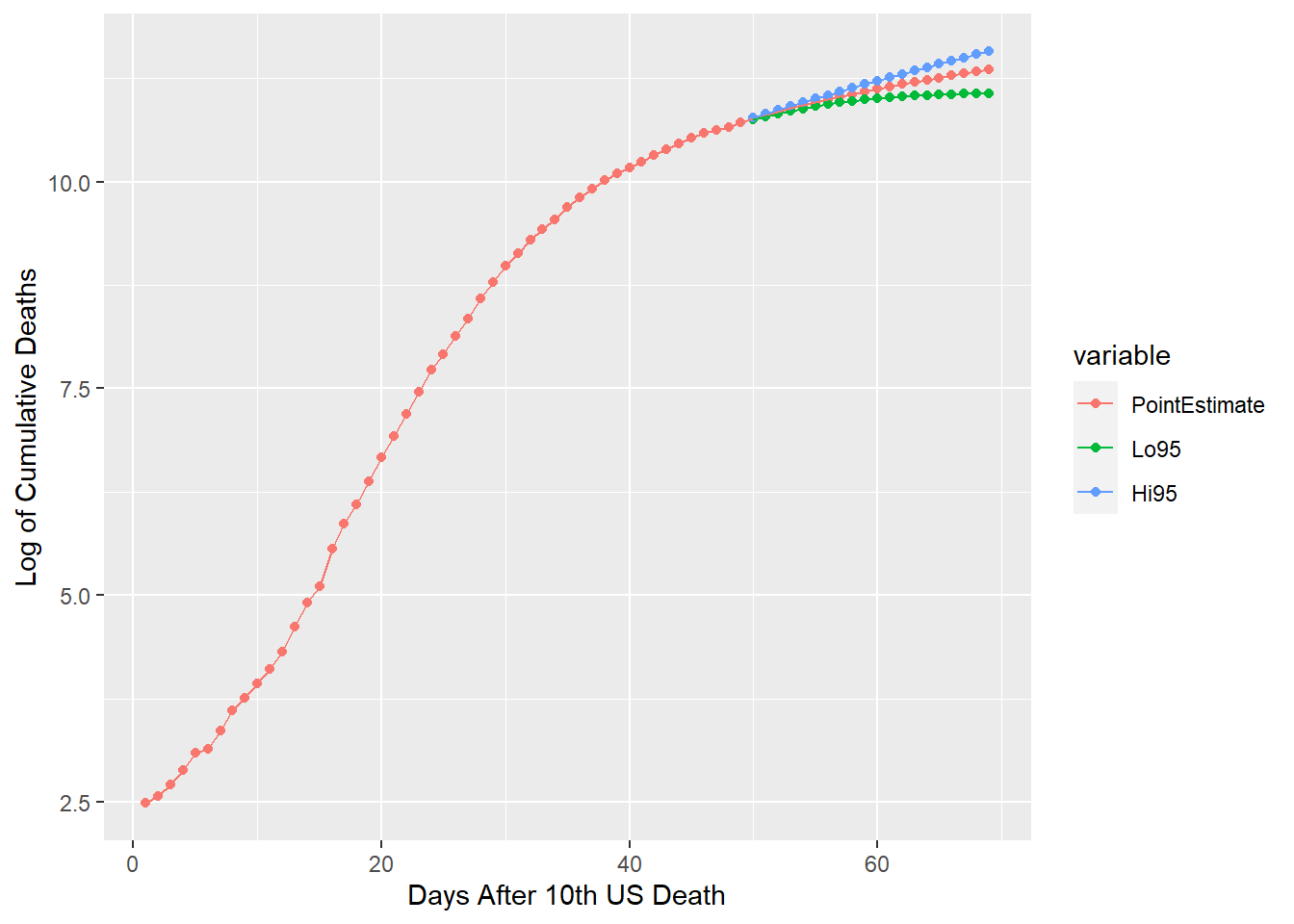
ggplot(gusf[which(gusf$value > 0 & gusf$id > 39),], aes(x=id, y=value, group=variable,
      colour=variable))+geom_point()+geom_line()+xlab("Days After 10th US Death")+
      ylab("Log of Cumulative Deaths")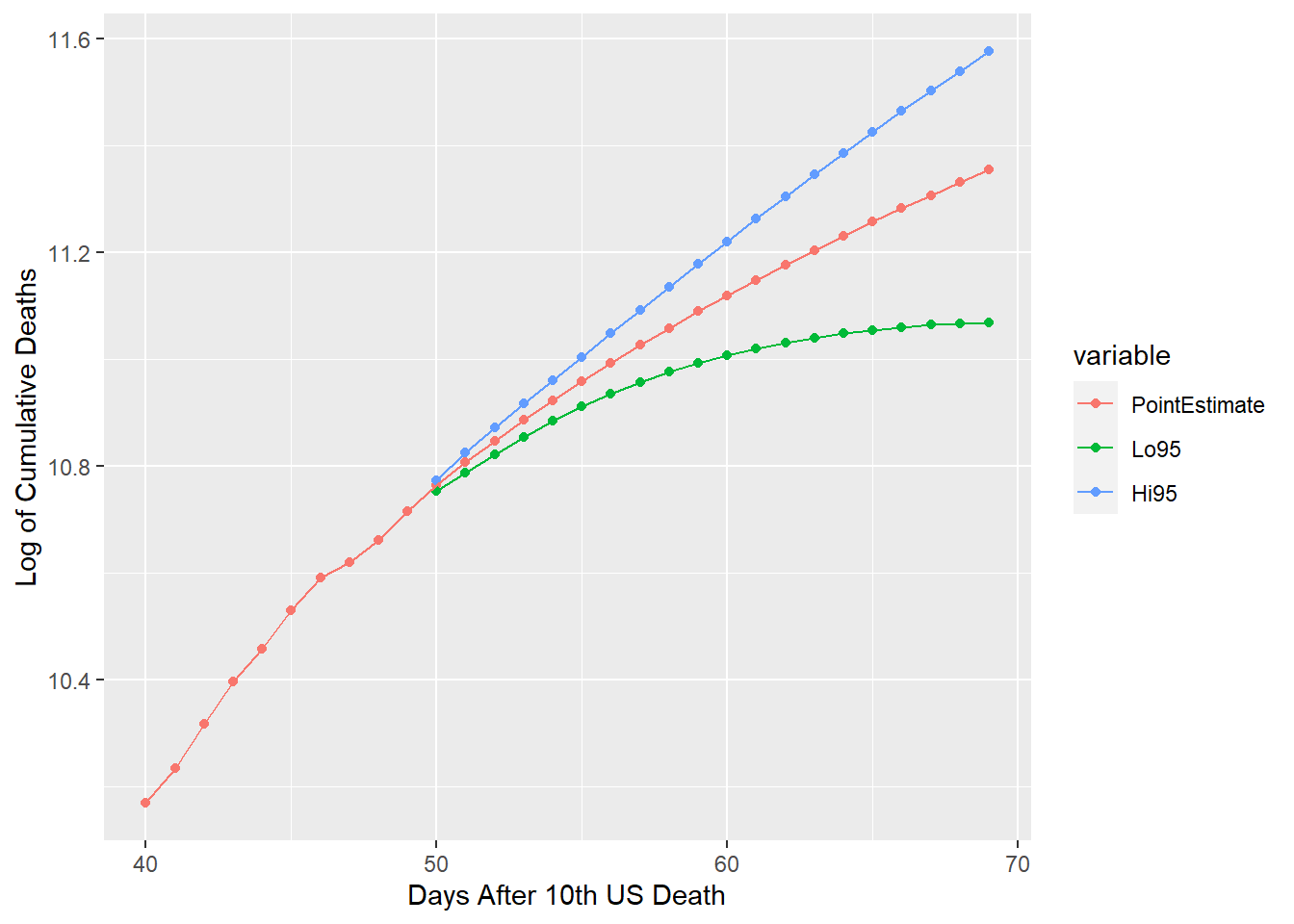
A 20-day forecast for the US is generated and plotted above along with 95% confidence intervals. This same modeling technique could be appropriately used on any or all of the other countries in this dataset. It is important to note that I’ve revised the values for the lower confidence bound. This and most time series models have heteroskedastic forecasts. This consequently can yield values of the lower confidence bound that are decreasing. Since CDFs are restrained to be monotonically increasing, my revision edits the lower confidence bound to match these distribution requirements.
Conclusion
These visualization processes demonstrate the type of background programming behind the html interactive plots that could be accomplished and implemented by adding this code to an RShiny program. The predictive modeling and forecasting is flexible enough that it could be applied to just about any country. However, it is dependent on one of two caveats. First, the duration must be long enough to provide downward concavity in the logCDF. Otherwise, the model will constantly predict more deaths on instance t+1 than instance t. If the first caveat doesn’t hold, the second caveat is that a predictive model may still be generated but not for any long-term forecasting. If the first caveat holds, long-term forecasting is more appropriate, but ought to be allowed to change and update as new data are acquired. With this in mind, I’ve built this program in such a way to allow my model to be easily modified by incoming data.
My PDF plots appear to consistently suggest that climax points are about a month to a month and a half beyond the first ten deaths. If this holds for countries that have been exposed to the virus late, then the majority of the pandemic is likely to be over before the end of May. This expectation relies on the assumption that there isn’t a second wave of COVID-19. If unknown covariates are approximately constant the assumption is a good one. However, it is doubtful that such covariates won’t change with the progession of the virus. Consequently, I recommend adding further analysis to these results if second wave deaths are observed.